Responsibilities: Application | UX | UI Personal project

FLIPKART

‍Version 7.57πŸ“–

Simplifying for a smoother online shopping experience

Flipkart is a household name in India, renowned for its extensive range of products and competitive pricing. With the rise of online shopping, Flipkart has become a go-to destination for millions of shoppers. However, as user-friendly as it may seem, every screen is packed with a plethora of information, and it can be challenging for users due to the large amount of information packed into every screen, making decision-making and navigation confusing.

‍OBjective❓

Analyzing existing screens of the Flipkart application.

The primary objective of this case study is twofold: firstly, to gain insight into users' experiences while navigating the Flipkart app and to examine the impact of the crowded screen layout on their decision-making process and time taken. Secondly, the study aims to conduct an analysis of the existing screens of the Flipkart shopping app and identify areas that can be improved to enhance the overall user experience.

‍the challenge❓

Enhancing the user experience by making the app look easy.

To improve the overall user experience by identifying the pain points and creating a more user-friendly design language, while also ensuring that the app is easy to navigate and understand.

‍Research PlanπŸ‘”πŸ”

Conducting in-depth interview.

with three Flipkart Application users who have utilized the app within the last month. The sample will comprise of individuals who identify as Men, Women, or Other and fall between the ages of 18-55. The primary objectives of the study are twofold: firstly, to explore how users experience the navigation of the Flipkart app and secondly, to examine the impact of the crowded screen layout on the decision-making process and the time taken for it.

DISCUSSION GUIDEπŸ’¬

We developed a targeted list of questions for conducting interviews to gather specific information.

We developed a targeted list of questions for conducting interviews to gather specific information.

We devised a suitable task to document the user experience that we aim to evaluate and enhance.

DEFINING scope & limitationsπŸ’¬

We created a Persona and listed pain points to enhance the user experience.

After analyzing user feedback and reviews, it has become evident that several challenges commonly arise. These include an excessive amount of advertisements that clutter the screen and make navigation confusing at times. Additionally, the sub-category pages that open after selecting a shopping category lack uniformity, which can cause difficulties for users trying to shop from the category menu.

User'S FlowπŸ§‘πŸ§‘

Making it easy for the User.

Simplifying navigation and layout.

the solution πŸ’Ž

So what should we give them?

A user-friendly layout that is easy to navigate, register and aids the decision-making for an effective user-experience.

Wireframes βœοΈπŸ—’

We worked to create an alternative layout that builds upon the existing design, and we believe it includes visually superior enhancements.

usability test πŸ“±

Asking the users to repeat the Task

After finalizing the flow and layouts, we created a simple prototype and invited users to test it by performing same task again. This allowed me to identify areas where users encountered difficulties and determine which areas of the product needed improvement based on actual usage.

‍HI-FI DESIGN πŸ’¬

We aimed to simplify and standardize the layouts while improving the overall style and tidiness of the app.

‍usability test πŸ“‹

So what happened?

The user was asked to add an allergy to nuts during the profile building.
‍
☝️
I noticed that she had to scroll and look out from a long list of allergies for the one that was requested.

✌️
I also saw that she was debating whether to click on the radio button on right the or the text on the left.

Summary 🧠

Insights gained.

Upon examining a problem in the user flow, we discovered that there were multiple issues that needed to be addressed. By conducting a simple test, we were able to significantly improve the user experience. Changing certain elements not only made it easier for users to find the required actions, but it also reduced the overwhelming feeling caused by too many elements, ultimately shortening the time needed for them to complete tasks.

We found that there were several alternative design ideas and solutions that could work efficiently within the scope of our study. Therefore, we decided to implement simple yet effective changes while building upon the existing design to further improve it.

Redesign explanationπŸ‘©πŸ”¬

The Flipkart Shopping Application.

The Home Screen

We restructured the layout with a larger grid to enhance user experience, and added crisp action options for easy navigation. To facilitate quicker decision-making, we used yellow highlights to emphasize the primary navigation options and search bar. Based on the context of the existing app, we strategically placed two advertisement areas, and arranged the content below them in a cleaner format. Moreover, we made changes to the nav bar action buttons to offer more convenient options for users.

The Grocery Screen

To align with the language of the home screen of the application, we applied highlights on the grocery home page for immediate actions, allowing for faster navigation. We placed the advertisement after the primary navigation, and added a direct button to the cart based on the context of the existing app. In addition, we included a 'shop by categories' feature for groceries, recognizing its importance for easier navigation from the home screen of the Flipkart Grocery app store.

The Category Screen

Building upon the design style of the home screen, we modified the category screen layout to enhance the visual appeal and improve user experience. In the previous version, certain categories had subcategories listed on a separate screen to narrow down search options, while others did not. To create a consistent browsing experience, we added subcategories as drop-down menus for each main category.

The Search Result Screen

We retained the existing effective layout with the main actions highlighted at the top of the screen and avoided having the nav bar below as it would not be necessary. Furthermore, we added color options for products in the description and marked offers with a tag, showing the exact difference in the original and offer price. We enhanced the visuals by using a uniform style of background for product images and improved the product descriptions for better understanding.

The Product Screen

We included color options for better visual decision-making and simplified the product description format on this screen. Additionally, we removed the area for advertisement irrelevant to the product.

The Cart Screen

We streamlined the cart layout and action buttons to improve their clarity and accessibility. The insurance suggestion was relocated to the bottom of the page, following the price breakdown, to reduce screen clutter and enhance user experience.

solution

Native app for management
and optimization communication
between parents and their toddler nanny

Parents Onboarding

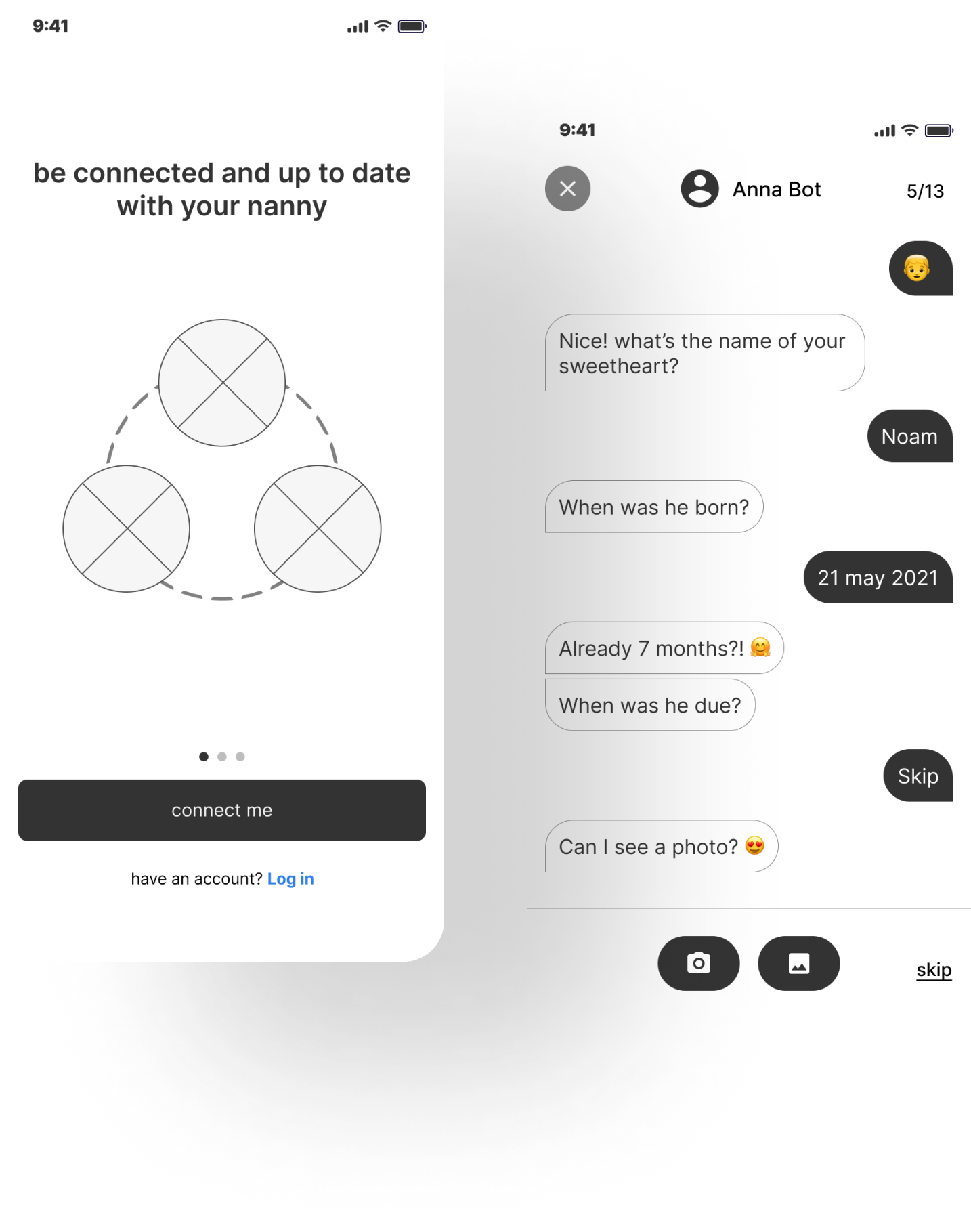
After the parent has logged in through one of his social media profiles the app forwards him to chat with a bot that will take the information about the toddler.

Nanny’s Onboarding

All the information that was received during the parent's onboarding will be displayed to the nanny.

Home Instruction

To decrease unnecessary engagement with explanations to the nanny the app will allow adding AR notes around the house.

Home Instruction

So that the nanny can easily find what she needs.

Nanny’s Interaction

On the nanny's home page she will see all the messages left for her and enter the information about the toddler's agenda.

Parents Interaction

On the parents home page they can see all the info collected during the day in a quick and easy scan.